A little magenta never hurt anybody.
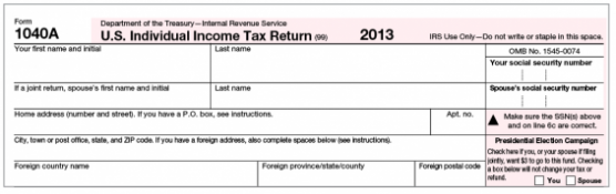
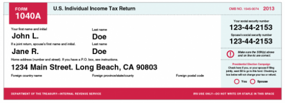
At first, my job sounds a little superficial—as an Art Director I specialize in “making things pretty”. I’m the Tyra Banks to client makeovers. But I’d argue that even a job as trivial sounding as design in this world, goes a long way to making life better for everyone. Without realizing it, even minor design changes can a have drastic impact (for better or worse) on how you perceive the world around you. I’m a firm believer that just a little color can change anything. I found a great example just recently when I went to do my taxes—I couldn’t tell the difference between all the different forms. I was just looking for my 1040A, already knew what I needed, but filtering through all the paperwork took me way longer than it should have. I experimented by just adding some basic color hierarchy to the top of the classic 1040A. I found with just a few key pops of color we could easily differentiate between form types and more easily locate important sections within it.
Before:
After:
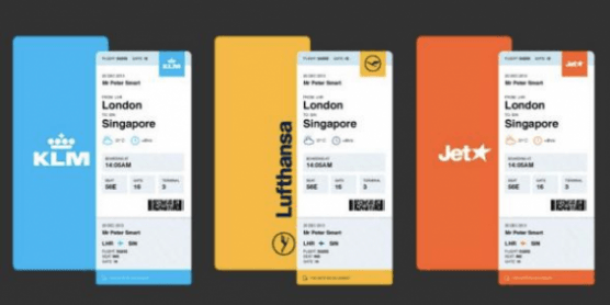
Another great example is the boarding pass. Recently designer Peter Smart re-imagined what our classic boarding pass design could be updated to with several simple changes, among several other great problem-solving design ideas on his 50 Problems in 50 Days blog. He did simple fixes ranging from color-coding the main airline hubs, along with switching the format to vertical vs. horizontal so it more easily folded into a passport or wallet. With only these small tweaks the traditionally cumbersome boarding pass is now easier to hold and navigate visually. Imagine how many missed flights, wrong gates and ‘hey you’re in my seat’ arguments could be avoided by this one simple change.
Even just this last week, a student made news by claiming the U.S. government could save $400 million with a simple font change. He started experimented with the different fonts used at his school and found that some fonts used less ink than others and by switching he could cut the schools ink consumption by 21 percent. From there he did the math and found the United States government could save $400 million by using a lighter font like Garamond exclusively, cutting consumption by almost 30 percent. When we design solutions for clients everything comes back to the concept. It’s not just about how attractive something is, it’s all about the idea behind it. We don’t want to design something beautiful just to be beautiful—that’s not helping anyone. While “making things pretty” is what I contribute to any given project, I do it to improve life for the end user. I make banner ads more entertaining to look at, websites easier to navigate and tedious paperwork more clear. Creating something that’s both beautiful and useful to the end user is what defines great, world-changing design.
Related Posts
 Reset and Reflect
A new year often marks the opportunity for a fresh beginning, as January offers each of us a clean slate. It’s a chance for us to press the “reset” button after the holiday break and get revved up for the coming year. But it is also a time to reflect upon the most recent 12 […]
 A Tale of Two eBlasts
There is such a thing as too much creativity. Check out these two eBlasts. Both are from MyHabit, Amazon’s flash sale website. If you’re unfamiliar with the concept of a flash sale, here’s a basic primer. Essentially, it’s an ecommerce version of Black Friday that happens every single morning via email and smartphone app for […]
 Our Marketing Trends For 2014
1. Character CountsIf Ron Burgundy has taught us anything, it’s that giving your brand a voice, and bringing that voice to life with a fictional character, can pay dividends. Popping up on everything from Dodge Durango ads to ESPN segments, it’s nearly impossible to escape his legendary charm—and finding new and creative ways to introduce […]