The Play Button… An Evolution of the Poster Frame
The play button is the lead singer of any video player’s UI (user interface) ensemble. It’s the biggest, it’s used the most, and it’s always at the center of attention. Volume and Share are its jealous bandmates never really getting the same recognition yet feel as though without them, the video player UI just wouldn’t be the same.
The play button, ego and all, changes shape, color and size across video player UIs, meant to match its surroundings. However, one thing that never seems to change is the location within the video player’s footprint when inactive, ie. the poster frame: dead center.
The centered position has become so second nature to the UX (user experience) during playback that it’s become invisible, yet completely functional. We know it’s there, so we simply tap the center of the screen to pause video playback instinctively. And like magic, it appears, even if only momentarily, at the ready for when we return. Prime examples of this are YouTube and Amazon Video.
Video content varies in how it is framed on a screen. If you’re watching a movie, the actors are typically slightly off-center. Sports footage has players scattered all over the screen. News outlets place their talking heads right in the middle of the screen. When the general public captures UGC (user generated content) the subjects usually end up centered as well.
So what does this mean for the ever-present play button that sits in the middle of the screen? More important, what does it mean to a brand?
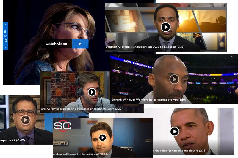
This inactive position can create some awkward situations using what is called the ‘poster frame,’ or that screen snippet you see before hitting play, as illustrated in the graphic above. ESPN delivers a lot of videos, most featuring top athletes and media personalities, all with personal brands and images to maintain. Making them look silly because there is a play button covering their nose or eye socket or entire face doesn’t do them any service and detracts from the emotion attached to the image or story being delivered.
While ESPN and many others are getting it wrong for the most part, other high profile sites are getting it right. Take a look at CNN and MSNBC’s video grids below for example; two high-volume video sites featuring mostly centered talking heads. MSNBC have placed a lone play button in the upper left corner which stays out of the way – for the most part, but can cause some odd tension points when it gets close to the centered subject’s head. CNN however have placed the play button in the lower left corner, above the video title, completely out of the way. This is the optimal solution for this UI poster image issue, and doesn’t cause any unfortunate brand image situations for any of its subjects.


Ultimately, video content providers have a responsibility to the brands they’re presenting on screen. The position of the simple play button can have a huge impact, which is why the other functions are so jealous. Now if they’d all integrate the invisible Play/Pause UX during playback instead of making the user click or tap a tiny 20px x 20px play/pause button, they’d be that much further ahead in the video UI game. But that’s a blog post for another time.
Images ©ESPN.com, ©MSNBC.com, and ©CNN.com.


